Wisconsin State Climatology Office
DAILY TEMPERATURE TIME SERIES PLOT
The accompanying graph shows the daily temperature variations at a particular station throughout the year as compared with their corresponding long-term averages.
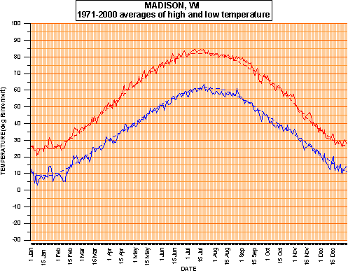
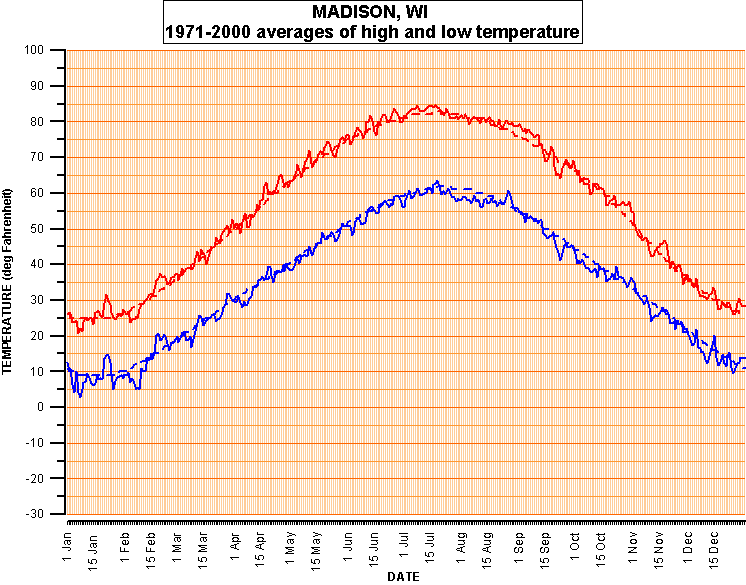
The vertical black lines represent the observed maximum and minimum temperatures for each day during a given year. For comparison, the red curve is the 30-year (1971-2000) average high temperature for each day at that station, while the blue curve is the 30-year average low temperature for each day.
The annual variations in the temperature plots are apparent, with a summer maximum and a winter minimum.
The average high and low temperatures were calculated from 30 years of high and low temperatures for each day. Specifically, the average high temperature for 15 June was obtained from the 30 observed daily high temperature values for 15 June commencing in 1971 and ending in 2000. The average low temperature for that date was obtained from the 30 minimum temperature values for the interval. Therefore, the curves for the average daily high and low temperatures will show a greater variability than curves from the daily "normal" high and low temperatures that have been initially smoothed. For example, compare the curves for Madison. The 30-year average high and low temperatures for each day appear as solid red and blue curves, while the dashed curves are the daily "normal" high and low temperatures obtained from the National Climatic Data Center's Climatography 84 for Madison.
Please use the return button on your browser to return to previous page.
Latest revision: 1 June 2003
Comments on the web page ...
SCO Web AdministratorURL Address: https://www.aos.wisc.edu/oldsco/stations/time-temp.html